AI Snippets — Napkin AI
Become the Presentation Champion with only one Napkin
How often have you found yourself drowning in a sea of text, desperately wishing for a magic wand to turn it into something visually digestible? In the high-stakes world of presentations, words alone often fall short of making an impact.
Welcome to the first AI Snippets post, a series dedicated to showcasing innovative AI solutions that tackle real-world problems. Today, we’re diving into Napkin AI, a tool designed to revolutionize how you communicate by turning text into stunning diagrams in mere seconds.
Sometimes text is not enough
“A picture is worth a thousand words.”
Has it ever happened to you that you struggled to understand a piece of text, and then a single diagram made everything clear? Or perhaps you needed to create a presentation that just looked too dry, no matter how much you tweaked the text?
Visuals don’t just clarify; they make information memorable, foster engagement, and can transform a tedious presentation into a captivating experience.
The Napkin AI website is designed to help you with exactly that: transforming any text into a visual diagram in mere seconds.”
Example — Cash Flow and Profit
To illustrate, let’s look at the following text:
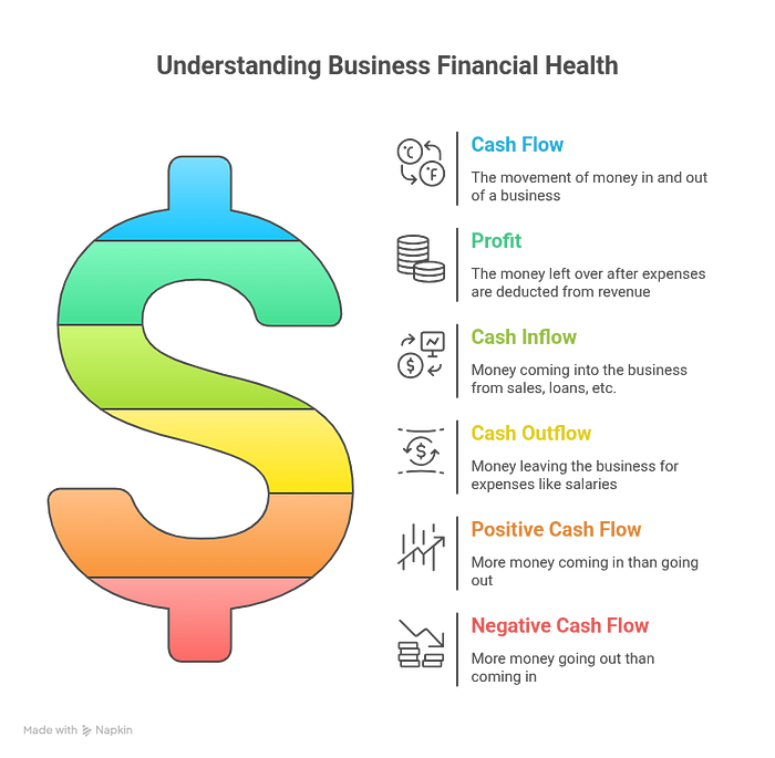
“Cash flow refers to the actual money moving in and out of a business. When a business receives payments from sales, loans, or investments, that’s cash inflow. When it pays for expenses like salaries, rent, or supplies, that’s cash outflow. Positive cash flow means the business has more money coming in than going out, which is essential for paying bills and funding operations. Negative cash flow means more money is leaving the business than entering it, which can lead to financial difficulties.
Profit, or net income, is the money left over after all expenses have been subtracted from total revenue. This includes both cash expenses (like salaries) and non-cash expenses (like depreciation, which accounts for the wear and tear on assets over time). A business can be profitable on paper (meaning its revenues exceed its expenses) but still have poor cash flow if customers are not paying quickly enough, or if a lot of its expenses are due immediately. Therefore, both strong cash flow and good profit are important indicators of a business’s financial health.”
To truly put Napkin AI to the test, I fed it the text on cash flow and profit. After exploring various diagram options, I settled on a visual that clarifies these concepts:
Getting Started with Napkin AI
To start using Napkin AI, go to
https://www.napkin.ai/
(PC only) and press on “Get Napkin Free/Sign In”, after that you will be able to sign in with your google account and start creating.
On the website, you can create a new “Napkin” in three ways:
Start with a blank one and insert your text.
Import text from an existing file, with support for Docs, PDF, PPTX, MD, and HTML.
Generate text with AI, where you can choose any topic in the world and receive AI-generated text on it.
Turtles!
To test the last option, I prepared some text about turtles (of course) with a few diagrams I created in a minute. Feel free to take a look: https://app.napkin.ai/page/CgoiCHByb2Qtb25lEiwKBFBhZ2UaJDc3MWZhODg1LWE0NmQtNGY3Yy05OThlLWI4ZWJhYTg4OGVjNw?s=1
And here are some of the diagram that I got:
Pricing
Currently, Napkin is in beta, and most of its features are available for free. For users needing more, Napkin offers Plus and Pro tiers. These paid plans provide additional benefits such as more AI credits, the option to remove Napkin branding, team management tools, exclusive designs and more.
The Plus plan costs $12 per month, while the Pro plan is $30 per month. You can also get a 25% discount if you opt for an annual subscription.
For most casual users, the free tier will likely be more than enough. One commendable aspect of Napkin’s approach is their refreshingly unobtrusive promotion of premium features. Unlike many freemium services, they don’t aggressively push upgrades, I didn’t even know that there is paid plan until I found the pricing tab on accident.
Limitations, and Human Touch
So, will Napkin AI solve all your problems? In my opinion, not yet. It’s a innovative and unique product, but the diagrams can be a bit repetitive (at least in the free plan), and with more complex texts full of numbers, it might falter. Sometimes none of the diagrams really fit what you have in mind and you get nothing from it.
It’s important to note that human involvement is still required in the process to decide which diagram is most suitable for the case and to ensure there are no errors.
Conclusion
In conclusion, I believe this is a brilliant tool that can sometimes help you transform dry text into a visual and impressive diagram. And if not, at least you can have better directions to present the text.
Why not give Napkin AI a spin yourself? Head over to https://www.napkin.ai/ and unleash your inner presentation champion.
I would love to see the incredible diagrams you create, share them in the comments below!


Wonderful 😊
True and in healthcare, it’s often more than a thousand. A single image, whether it’s a scan, a graph, or a user interface, can communicate what paragraphs cannot.
Visual clarity isn't just aesthetic it's functional, life-saving, and trust-building.
As a B2B HealthTech content writer, I’ve seen how the right visuals paired with the right words can transform understanding and decision-making across the board.